

Good interactive screen design makes it easy for people to understand what to do, find what they need and complete a task without frustration. The most effective approaches use clear navigation, readable content, responsive touch controls and timely feedback. Here are seven ways to create interactive screens that people want to use.
Key takeaways
Clear navigation helps users understand their options without needing instructions.
Touch targets, text size and screen layout should reflect how and where people use the display.
The best design approach depends on the screen's purpose, audience and physical environment.
An interactive screen can look impressive and still be difficult to use. A visitor might struggle to find a building directory, a shopper might overlook a product category, or a customer might abandon a self-service kiosk because the next step is unclear.
The challenge is not simply getting someone to touch the screen. It is making every interaction feel worthwhile.
Interactive screens appear in shopping centres, museums, corporate offices, retail stores and public service environments. Each setting creates different expectations. Someone using a ticketing kiosk wants speed, while someone exploring an exhibition may be happy to spend several minutes discovering content.
For Trinergy Digital, a software and creative technology company in Kuala Lumpur, effective screen design starts with understanding what people need to accomplish rather than deciding which animations or visual effects to include.
The seven approaches below focus on practical design choices that help users understand, explore and complete tasks.
How did we choose these seven interactive screen design approaches?
The strongest interactive screen design approaches address real usability problems rather than relying on visual appeal alone.
We selected these seven approaches based on established user experience principles and their relevance to common touchscreen environments. They are design methods, not competing software products, and they can work together within the same interface.
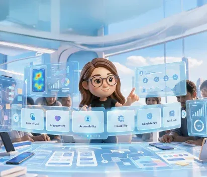
Our selection considered five criteria:
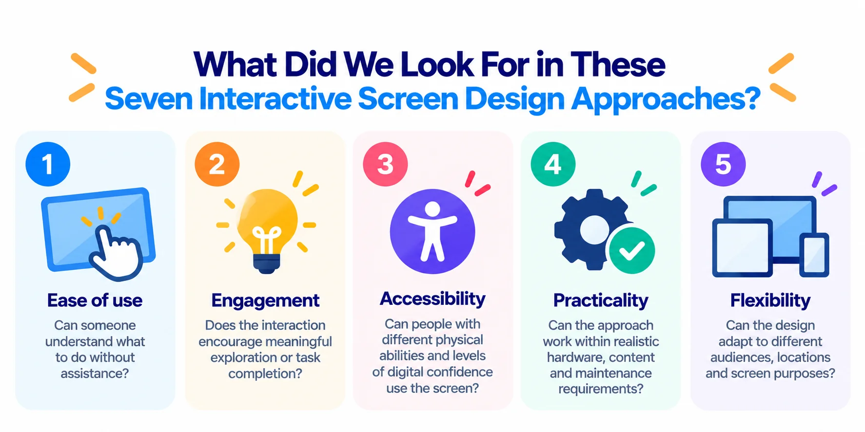
Ease of use: Can someone understand what to do without assistance?
Engagement: Does the interaction encourage meaningful exploration or task completion?
Accessibility: Can people with different physical abilities and levels of digital confidence use the screen?
Practicality: Can the approach work within realistic hardware, content and maintenance requirements?
Flexibility: Can the design adapt to different audiences, locations and screen purposes?
These criteria reflect common usability principles, including clear system feedback, consistency and reducing unnecessary mental effort.
No single approach is best for every project. A public information kiosk and an interactive brand installation may require very different design decisions.
Seven ways to make interactive screens more engaging
Effective interactive screen design gives people a reason to interact and makes their next action obvious.
The following seven approaches address different aspects of the user experience, from the first touch to the final action.
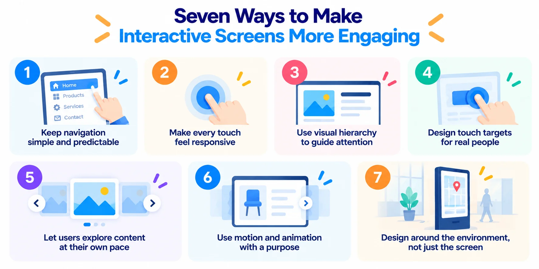
1. Keep navigation simple and predictable
Simple navigation helps people find information without having to learn how the interface works.
A touchscreen in a public space often has only a few seconds to communicate its purpose. If the first screen presents too many choices, visitors may hesitate or walk away.
Start by identifying the most common tasks. A shopping centre directory, for example, might prioritise store search, dining, facilities and directions.
Keep the main navigation visible where possible, and use familiar labels rather than creative names that require explanation.
Best suited for: Shopping centre directories, hospital kiosks, visitor information screens and corporate reception areas.
One drawback: Simplifying navigation can make complex content harder to organise. You may need additional levels for less frequently used features.
2. Make every touch feel responsive
Immediate visual feedback reassures users that the screen has registered their action.
When someone taps a button, the interface should respond visibly. A button might change colour, a selected item might become highlighted, or a loading indicator might appear.
Without feedback, people may tap repeatedly because they cannot tell whether anything happened.
Good touchscreen interface design considers the complete interaction, including what happens while the system processes a request.
A product catalogue that takes several seconds to load should communicate that the request is being handled rather than leaving the user staring at an unchanged screen.
Best suited for: Ordering kiosks, registration systems, ticketing screens and interactive product catalogues.
One drawback: Excessive animations and visual effects can slow down interactions, particularly on older hardware.
3. Use visual hierarchy to guide attention
A clear visual hierarchy helps users identify the most important information and actions.
Visual hierarchy refers to how designers use size, colour, contrast, spacing and positioning to establish the order in which people notice content.
On an interactive screen, the primary action should usually be more prominent than supporting information.
For example, a museum display might feature a large image and a clear invitation to explore, followed by smaller buttons for additional topics.
Avoid giving every element equal visual weight. When everything competes for attention, people may struggle to decide where to begin.
Best suited for: Museums, exhibitions, retail displays and interactive storytelling experiences.
One drawback: Strong visual emphasis can distract from secondary information if the layout is not carefully balanced.
4. Design touch targets for real people
Comfortable touch targets make screens easier to operate and reduce accidental selections.
Unlike desktop interfaces, touchscreens depend on fingers rather than precise mouse pointers. Buttons placed too close together can create errors, especially when users are standing or moving quickly.
Designers should consider button dimensions, spacing, screen angle and the distance between the user and display.
For public kiosks, controls should also be positioned where intended users can reach them comfortably.
An interface tested only on a designer's laptop may behave differently on a large vertical display.
Best suited for: Public kiosks, transport terminals, self-service systems and touchscreen displays used by a broad audience.
One drawback: Larger controls occupy more screen space, which can limit how much information appears at once.
5. Let users explore content at their own pace
Interactive exploration gives users more control over what they see and how much information they consume.
Instead of presenting a fixed sequence, an interactive display can allow visitors to choose topics, compare products or explore visual content.
A property showroom might let visitors select a floor plan, examine available layouts and switch between unit types.
The experience becomes more useful when people can follow their interests without losing their place.
Clear back buttons, home controls and consistent navigation help prevent users from becoming stuck within the content.
Best suited for: Property galleries, museums, showrooms, educational exhibits and product discovery displays.
One drawback: Open exploration can make it harder to guide users towards a specific message or desired action.
6. Use motion and animation with a purpose
Purposeful animation can explain transitions, draw attention to important changes and make an interface easier to understand.
Motion works best when it communicates something useful. A panel sliding into view can show that new information belongs to a selected category. A progress animation can indicate that the system is processing a request.
Animations should not delay the user's next action.
For interactive display ux, the goal is to support understanding rather than decorate every interaction.
Motion preferences and accessibility also matter. Some users may find excessive movement distracting or uncomfortable.
Best suited for: Brand installations, exhibitions, interactive storytelling and product demonstrations.
One drawback: Animation can increase development effort, affect performance and create accessibility concerns when used excessively.
7. Design around the environment, not just the screen
The physical environment can determine whether an interactive screen succeeds.
A touchscreen interface that works well in a quiet showroom may be difficult to use in a busy shopping centre.
Lighting, screen height, viewing distance, noise and available floor space all influence how people interact.
For example, an interactive directory at a Kuala Lumpur shopping centre may need readable text under bright indoor lighting, clear navigation for multilingual visitors and controls suitable for people carrying shopping bags.
Kiosk UI design should also consider whether users are standing, seated or using mobility aids.
Best suited for: Shopping centres, airports, hospitals, public buildings and outdoor information displays.
One drawback: Designing for a specific environment may require additional testing, hardware adjustments and installation costs.
Interactive screen design comparison table
The right approach depends on whether your screen is intended to help people complete a task, explore information or engage with a brand.
Design approach | Best for | Main benefit | Drawback |
|---|---|---|---|
Simple navigation | Directories and information kiosks | Faster access to information | May limit complex navigation |
Responsive feedback | Ordering and registration kiosks | Confirms user actions | Animation can affect performance |
Visual hierarchy | Museums and retail displays | Directs attention | Secondary content may be overlooked |
Comfortable touch targets | Public service kiosks | Reduces accidental selections | Requires more screen space |
User controlled exploration | Showrooms and exhibitions | Supports personal discovery | Less control over viewing sequence |
Purposeful animation | Brand experiences | Explains transitions | Adds development complexity |
Environment focused design | Public installations | Improves practical usability | Requires location specific testing |
The approaches are complementary. A retail kiosk, for instance, may need simple navigation, comfortable buttons and responsive feedback at the same time.
What should you check before committing to an interactive screen design?
Before approving an interactive screen design, test whether people can complete the intended tasks on the actual display, in its intended environment.
A polished prototype does not necessarily reveal problems with screen placement, touch accuracy or content readability.
Use the following checklist before moving into full development.
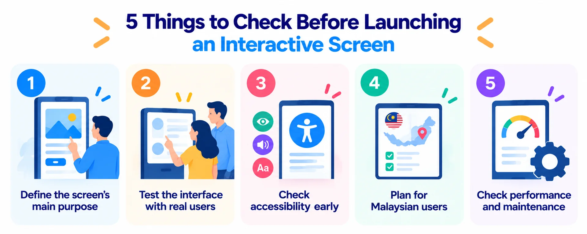
1. Define the screen's main purpose
Decide what success looks like. A directory might prioritise successful searches, while a registration kiosk might measure completed registrations.
Avoid adding features simply because the technology supports them.
2. Test the interface with real users
Ask representative users to complete common tasks without guidance. Observe where they hesitate, make mistakes or ask questions.
Jakob Nielsen's usability heuristics, last reviewed by Nielsen Norman Group on 30 January 2024, emphasise visible system status, consistency and error prevention. These principles provide a useful starting point for reviewing interactive interfaces.
3. Check accessibility early
Consider whether users can read the text, reach controls and operate the interface without complex gestures.
The World Wide Web Consortium's WCAG 2.2 guidance, published on 5 October 2023, includes a minimum pointer target size of 24 by 24 CSS pixels, subject to exceptions. This is a web accessibility criterion, not a universal physical kiosk button measurement.
Physical touchscreen dimensions, viewing distance and user needs still require separate testing.
4. Plan for Malaysian users
For a public kiosk in Malaysia, consider whether Bahasa Malaysia and English are appropriate for the intended audience. Additional languages may be useful depending on the location.
Language selection should be visible, and translated content should be tested to ensure that longer labels fit the layout.
5. Test performance and maintenance
Check how the interface behaves when the network is slow, content fails to load or the system remains active throughout the day.
Agree on how staff will update content, monitor problems and restart the system when necessary.
A practical calculation for testing your screen
Consider a hypothetical shopping centre directory used by 300 visitors daily.
Suppose an initial test shows that 70% of visitors complete their intended search. After navigation improvements, a second test shows an 85% completion rate.
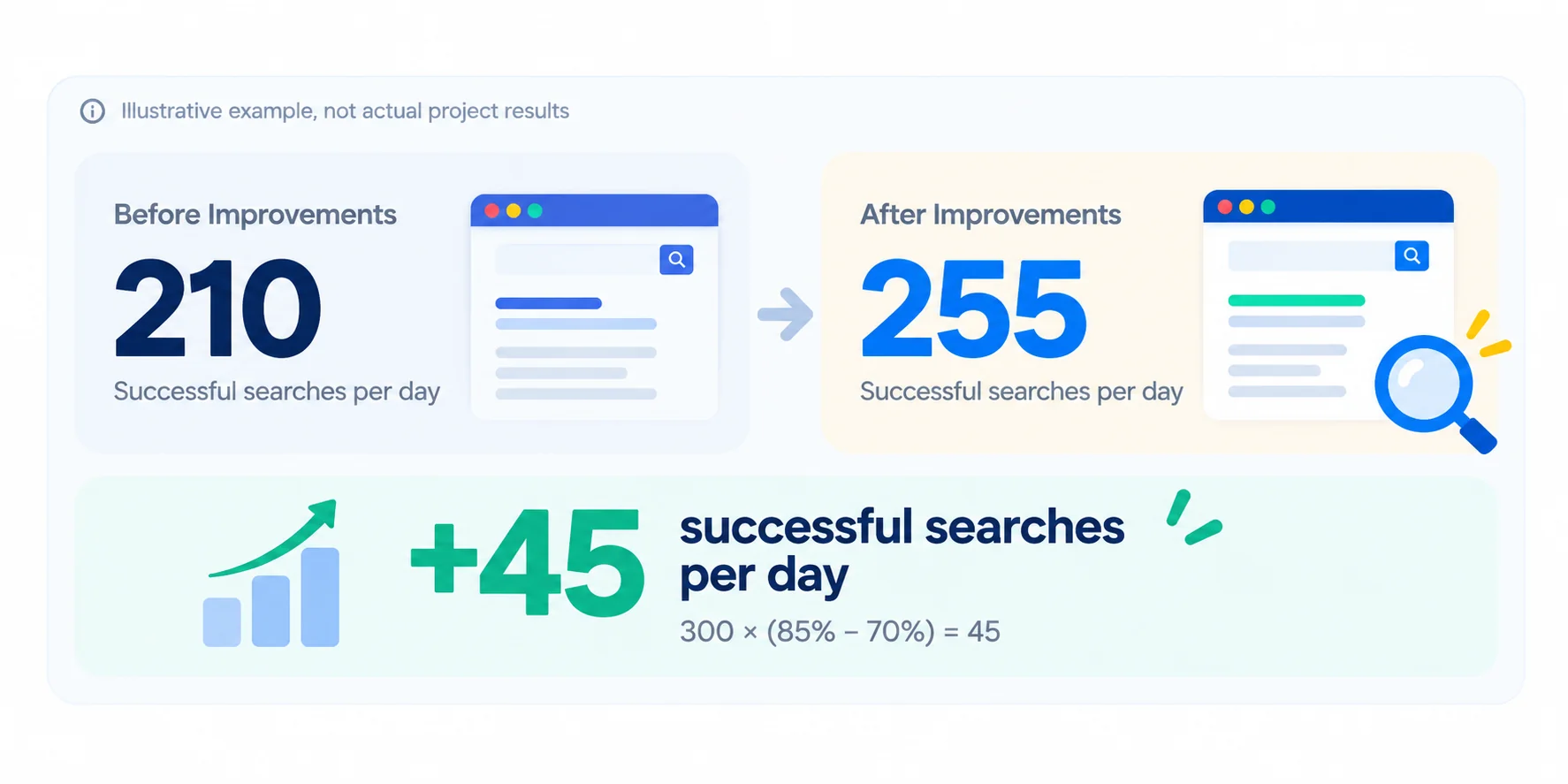
The example shows why task completion can be more meaningful than counting screen touches alone. Actual results depend on the interface, visitors and testing conditions.
Which interactive screen design approach should you choose?
Choose the design approach that addresses your users' most important needs first, then combine other techniques where they add value.
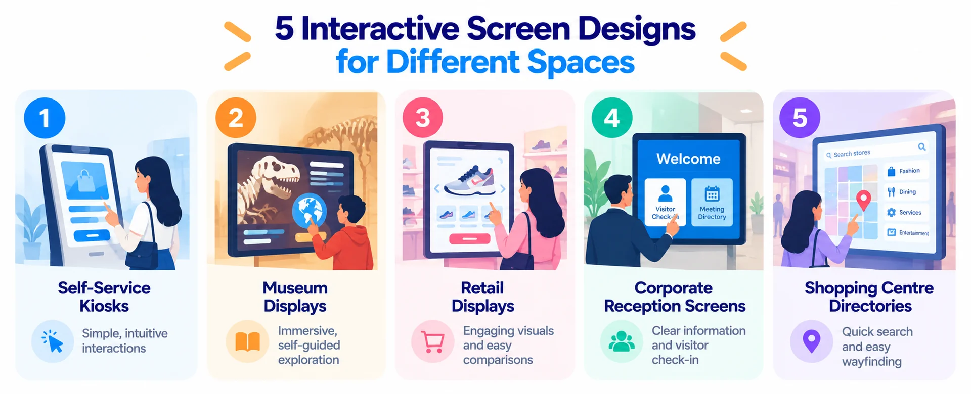
For a self-service kiosk, prioritise simple navigation, clear feedback and comfortable touch targets. People generally want to complete a transaction without unnecessary steps.
For an interactive museum display, visual hierarchy, user-controlled exploration and purposeful animation can help visitors discover information at their own pace.
For a retail product display, combine strong visuals with straightforward product comparisons. Make prices, features and next steps easy to find.
For a corporate reception screen, prioritise readable information, simple visitor actions and consistent branding.
For a shopping centre directory, focus on search, wayfinding, accessibility and the practical conditions around the display.
When deciding between approaches, remember that more interaction does not automatically create a better experience. The best choice is the one that helps users achieve their purpose with the least unnecessary effort.
Making interactive screens work for your audience
Interactive screen design succeeds when visual creativity supports practical usability.
A screen should be easy to approach, easy to understand and useful from the first interaction. Clear navigation, appropriate touch controls and thoughtful feedback matter more than adding features that people rarely need.
Trinergy Digital, a software and creative technology company in Kuala Lumpur, offers creative design services that include interactive screen design and user experience research. Its approach to digital experiences provides a starting point for businesses planning kiosks, interactive displays and other touchscreen applications.
Whether you are developing a retail experience, a visitor directory or a custom interactive installation, begin with the people who will use it and the tasks they need to complete.
Explore Trinergy Digital's creative design services or contact the team to discuss your interactive screen project.