



The best e-commerce website examples make products easy to find, understand and buy while giving the brand a distinct identity. We selected these 14 examples based on navigation, product presentation, mobile usability, trust, checkout thinking and how well each design supports the type of product being sold.
Key takeaways
Strong e-commerce design reduces the effort required to move from product discovery to purchase.
The right design depends on your catalogue size, product complexity, audience and buying journey.
Visual appeal matters, but navigation, product information, mobile usability and checkout deserve equal attention.
If you are planning a new online store, looking at successful websites can give you useful ideas. The goal should not be to reproduce another brand's interface. Instead, study why particular design choices work and decide whether the same principle fits your customers.
Trinergy Digital, a software and creative technology company in Kuala Lumpur, approaches e-commerce design as a combination of user experience, technology and business requirements. A visually impressive store still needs to help customers find products and complete transactions without unnecessary friction.
How did we choose these e-commerce website examples?
The strongest e-commerce website examples solve a clear shopping problem rather than simply looking attractive. We selected examples that demonstrate useful approaches to product discovery, catalogue organisation, brand communication, product pages, mobile shopping and conversion.
Our criteria were:
Navigation: Can shoppers understand where to go without learning the interface?
Product discovery: Does search, filtering or categorisation help customers narrow their choices?
Product presentation: Are images, specifications, variants and supporting information easy to understand?
Brand consistency: Does the shopping experience feel specific to the company?
Mobile usability: Can core shopping actions work comfortably on a smaller screen?
Purchase clarity: Are price, availability, delivery information and calls to action presented clearly?
Transferable ideas: Can another business learn something useful without simply copying the appearance?
Checkout deserves particular attention. Baymard Institute reported an average cart abandonment rate of 70.22% in its April 2026 checkout guide. Its research also identifies checkout friction such as forced account creation, difficult form entry and unclear fulfilment information as recurring problems.
The lesson is simple: an attractive homepage cannot compensate for a frustrating buying process.
14 e-commerce website examples worth studying
These online store design examples show that there is no single formula for a successful store. The useful question is not which website looks best, but which design decisions match the products, customers and buying process.
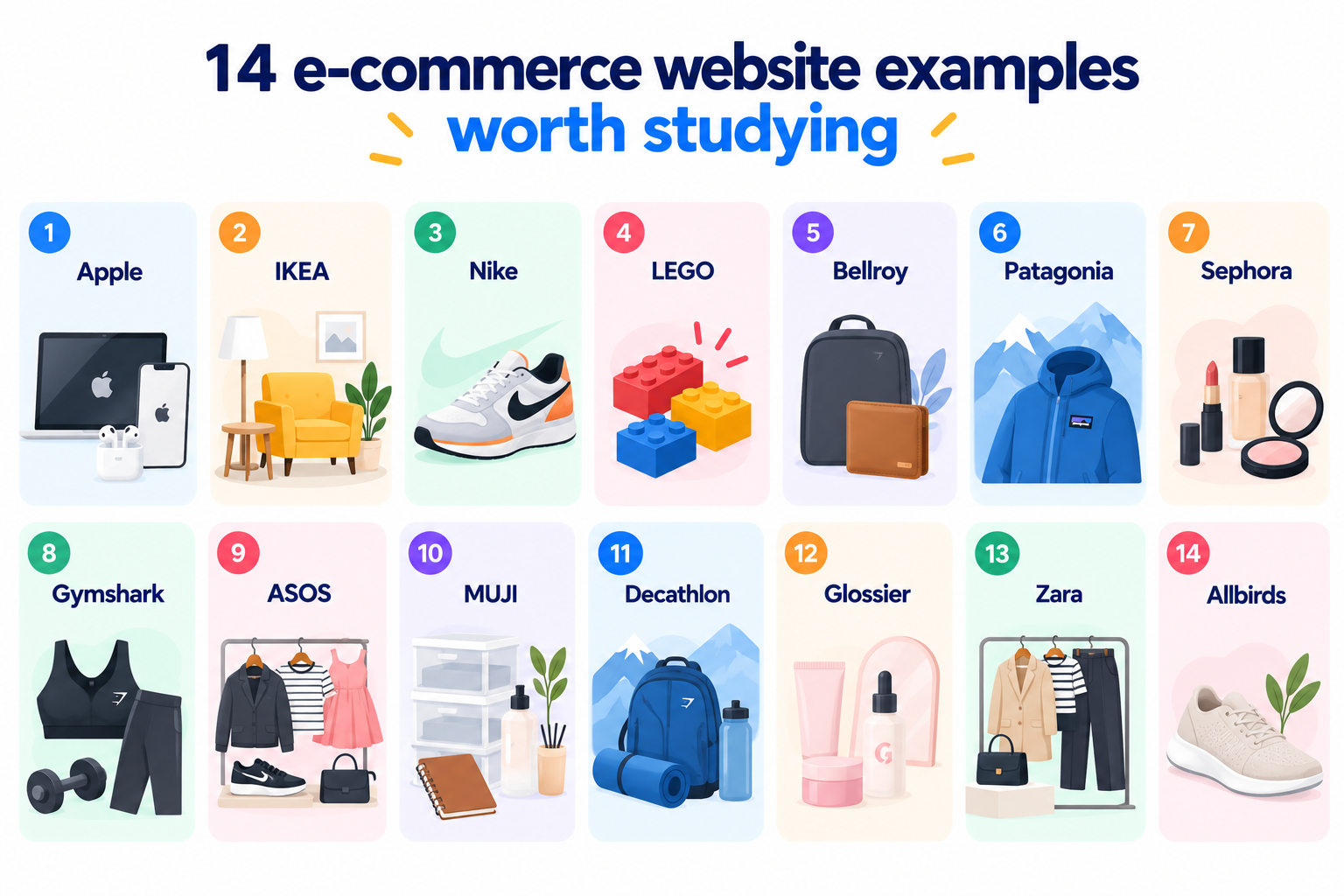
1. Apple keeps product decisions focused
Apple uses large product imagery, restrained layouts and clear pathways between product families. Technical products are introduced through benefits and visual explanations before customers encounter deeper specifications.
Who it suits: Brands with a focused catalogue and products that benefit from explanation, comparison and premium visual presentation.
What to learn: Reduce competing information and give important products enough visual space.
One drawback: This approach depends heavily on strong photography, brand recognition and carefully produced content. Smaller retailers may need more visible navigation and product information earlier in the journey.
2. IKEA connects inspiration with practical shopping
IKEA combines room inspiration with conventional catalogue browsing, allowing customers to move between ideas and individual products. IKEA Malaysia also supports online purchasing, favourites, delivery choices, collection options, assembly services and order tracking.
Who it suits: Homeware, furniture and lifestyle retailers where shoppers often buy several complementary products.
What to learn: Show products in context rather than presenting every item as an isolated catalogue entry.
One drawback: A large assortment creates considerable navigation complexity. Smaller retailers should avoid reproducing this depth when a simpler category structure would work.
3. Nike puts products and campaigns side by side
Nike combines editorial campaign imagery with direct routes into footwear, clothing and sport categories. The approach lets the store communicate a broader brand identity while keeping commercial destinations accessible.
Who it suits: Fashion, sports and lifestyle brands with frequent collections, campaigns and product launches.
What to learn: Brand storytelling can support commerce when customers can still reach products quickly.
One drawback: Large campaign imagery can compete with product discovery if the visual hierarchy is not controlled carefully.
4. LEGO makes a large catalogue easier to explore
LEGO organises products around more than conventional product categories. Shoppers can explore by age, theme, interest, price and other attributes. The Malaysian store also displays prices in ringgit and supports locally relevant shopping information.
Who it suits: Retailers with hundreds of products and customers who shop according to different criteria.
What to learn: Filters should reflect how people choose products.
One drawback: Numerous categories, promotions and discovery routes can create visual density, particularly on smaller screens.
5. Bellroy explains products through real use
Bellroy organises bags, wallets, luggage and accessories around practical situations such as travel, work, technology and everyday carry. Its product positioning helps customers think about where an item fits into daily life.
Who it suits: Brands selling products where materials, construction and practical details influence the purchase.
What to learn: Explain the job a product performs rather than relying on specifications alone.
One drawback: Detailed storytelling increases the amount of content that teams need to produce and maintain.
6. Patagonia gives product information a wider purpose
Patagonia integrates commerce with information about product use, materials, repair and environmental issues. Products therefore sit within a larger brand narrative rather than appearing as disconnected items.
Who it suits: Values-led brands where materials, manufacturing or product longevity matter to customers.
What to learn: Supporting information can strengthen product understanding when it relates directly to the buying decision.
One drawback: Extensive editorial content can distract from shopping if navigation does not distinguish information from purchase pathways.
7. Sephora handles product discovery across a broad beauty catalogue
Beauty shopping involves shade, skin type, product category, brand and personal preference. Sephora demonstrates how filtering, reviews and product information can help customers work through those variables.
Who it suits: Beauty, wellness and other retailers where customers compare many similar products.
What to learn: Give customers meaningful ways to reduce a large catalogue.
One drawback: Promotions, recommendations, loyalty features and product choices can make interfaces feel busy.
8. Gymshark keeps the route from campaign to product short
Gymshark uses strong lifestyle photography but connects campaigns directly with shoppable collections. Customers can move from visual inspiration to relevant products without having to interpret an elaborate interface.
Who it suits: Apparel and fitness brands built around collections and lifestyle content.
What to learn: Campaign creative should lead somewhere commercially useful.
One drawback: Image-heavy presentation can place greater demands on performance optimisation, especially for mobile connections.
9. ASOS prioritises discovery at catalogue scale
ASOS has to organise a very large fashion assortment. Search, categories, filtering, sorting and product recommendations therefore carry much of the experience.
Who it suits: Marketplaces and retailers with extensive inventories, many brands or frequently changing stock.
What to learn: The larger your catalogue becomes, the more important information architecture becomes.
One drawback: Large numbers of filters, promotional messages and recommendations can increase cognitive load.
10. MUJI lets the products carry the visual identity
MUJI's restrained aesthetic translates naturally to digital retail. Product imagery, neutral colours and straightforward layouts reflect the physical products rather than competing with them.
Who it suits: Brands with a strong visual identity and products that work well with restrained presentation.
What to learn: A website does not need decorative complexity to feel distinctive.
One drawback: Very restrained interfaces can make calls to action or product differences less obvious if hierarchy becomes too subtle.
11. Decathlon organises shopping around activities
Decathlon sells products across dozens of sports, which makes activity-based navigation especially useful. Its Malaysian online presence covers more than 60 sports and thousands of products, illustrating the need for clear catalogue organisation at scale.
Who it suits: Retailers whose products naturally belong to hobbies, activities or customer goals.
What to learn: Your category structure should use the language customers use when shopping.
One drawback: A very broad catalogue requires disciplined search, filters and taxonomy management.
12. Glossier keeps beauty shopping approachable
Glossier uses a relatively focused visual system, product photography and accessible copy to make beauty products feel less technical. The experience demonstrates how tone of voice can become part of interface design.
Who it suits: Direct-to-consumer brands with a focused range and recognisable personality.
What to learn: Product copy and interface copy should sound like the same brand.
One drawback: A highly distinctive tone can become restrictive if the company expands into categories requiring more technical information.
13. Zara makes imagery central to fashion discovery
Zara treats its online store partly like a digital fashion editorial, with photography occupying significant visual space. The approach gives collections a recognisable mood before customers inspect individual items.
Who it suits: Fashion businesses where seasonal presentation and visual direction strongly influence purchase interest.
What to learn: Product imagery can function as both navigation and brand communication.
One drawback: Unconventional interfaces can require more effort from customers who expect familiar e-commerce patterns.
14. Allbirds explains product differences without overwhelming the shopper
Allbirds combines lifestyle imagery with explanations of materials, product purpose and comfort. This helps distinguish products that might otherwise look similar in a conventional grid.
Who it suits: Brands whose differentiation depends on materials, product construction or a specific product philosophy.
What to learn: Give customers enough information to understand why one product is different from another.
One drawback: Repeating brand messages across product pages can make pages longer than necessary if information is not prioritised.
How do these 14 e-commerce website examples compare?
Each example solves a different problem, so your best source of e-commerce inspiration depends on what you sell and how customers choose it.
Website | Strongest design lesson | Best suited to | Drawback to consider |
|---|---|---|---|
Apple | Focused product storytelling | Technology and premium products | Content intensive |
IKEA | Shopping products in context | Furniture and homeware | Complex catalogue |
Nike | Campaign-led commerce | Sports and lifestyle | Imagery can dominate |
LEGO | Multiple discovery routes | Large catalogues | Many choices on screen |
Bellroy | Use-case storytelling | Considered physical products | Requires detailed content |
Patagonia | Product and brand education | Values-led brands | Editorial depth |
Sephora | Filtering and comparison | Beauty and wellness | Interface density |
Gymshark | Campaign to collection journey | Apparel | Image performance demands |
ASOS | Catalogue discovery | Large fashion retailers | High information density |
MUJI | Visual restraint | Design-led brands | Subtle hierarchy |
Decathlon | Activity-based navigation | Multi-category retail | Taxonomy complexity |
Glossier | Brand voice | Direct-to-consumer brands | Less suited to technical ranges |
Zara | Editorial presentation | Fashion | Less conventional navigation |
Allbirds | Product differentiation | Focused consumer brands | Longer product pages |
What should you check before committing to an e-commerce design?
A good e-commerce design should work for your actual customers, catalogue and operations rather than reproduce the appearance of one of the best e-commerce sites.
Check these areas before approving a direction.
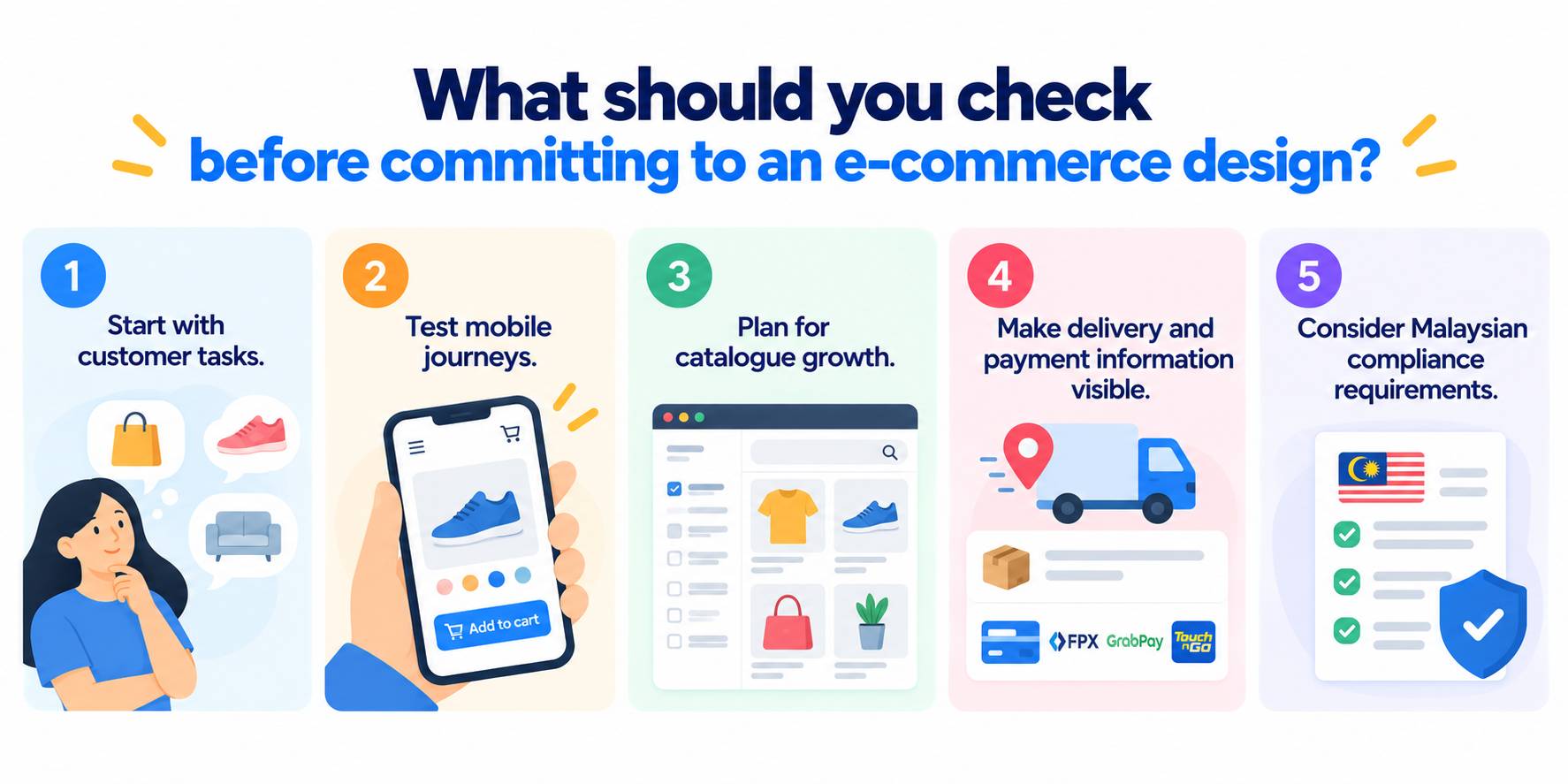
Start with customer tasks. Identify what customers need to do most often. A shopper buying a RM40 skincare product has a different decision process from someone comparing RM4,000 furniture.
Test mobile journeys. Customers should be able to search, filter, choose variants, read essential information, add products and check out comfortably on a phone. Mobile design deserves attention from the start rather than being treated as a reduced desktop layout.
Plan for catalogue growth. A navigation structure that works for 30 products may struggle at 300. Decide how categories, attributes, filters and search will work before the catalogue becomes difficult to manage.
Make delivery and payment information visible. Malaysian customers need practical answers about delivery areas, costs, fulfilment and available payment methods before committing to a purchase.
Consider Malaysian compliance requirements. The Consumer Protection (Electronic Trade Transaction) Regulations 2024 came into operation on 25 December 2024 and set disclosure requirements for online marketplace suppliers. Malaysia's Personal Data Protection Act 2010 also regulates personal data processing in commercial transactions.
Compliance requirements depend on your business model, so businesses should obtain appropriate legal advice rather than treating a design checklist as legal guidance.
A practical calculation for prioritising improvements
Imagine your store receives 50,000 sessions per month, 5% of visitors start checkout and 40% of those checkout sessions result in purchases.
The calculation is:
50,000 × 5% = 2,500 checkout starts
2,500 × 40% = 1,000 orders
If usability improvements increased checkout completion from 40% to 44%, the same traffic would produce:
2,500 × 44% = 1,100 orders
That is 100 additional orders from the same 50,000 sessions.
The example is deliberately hypothetical, not a promised conversion result. It illustrates why teams should evaluate checkout usability alongside homepage aesthetics.
Baymard's 2025 checkout benchmark found that 64% of desktop sites and 63% of mobile sites in its benchmark had a checkout user experience rated as mediocre or worse.
Which e-commerce design approach suits your situation?
Choose the design pattern that matches the main problem your customers need the website to solve.
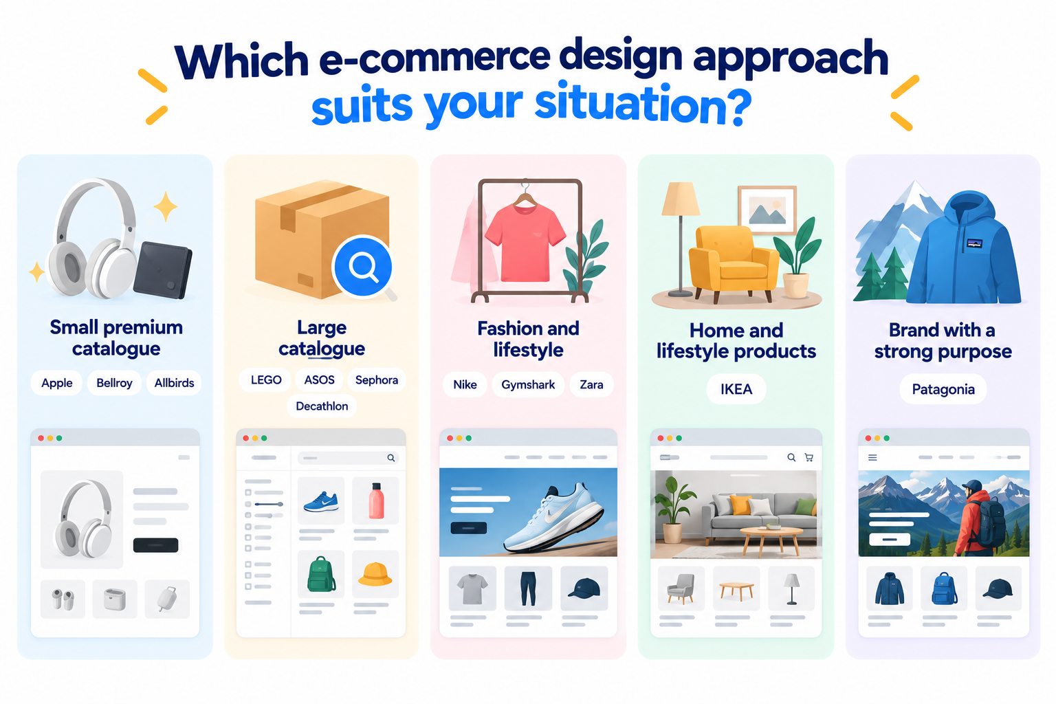
For a small premium catalogue, study Apple, Bellroy and Allbirds. These stores show how focused product presentation and detailed explanation can support considered purchases.
For a large catalogue, look at LEGO, ASOS, Sephora and Decathlon. Search, filtering and information architecture become more important as product choice increases.
For fashion and lifestyle, Nike, Gymshark and Zara provide useful e-commerce inspiration for connecting campaigns with collections.
For home and lifestyle products, IKEA demonstrates the value of showing products within rooms and practical use cases.
For a brand where values or product philosophy matter, Patagonia shows how educational content can sit alongside commerce.
For a Malaysian online store, localisation should go beyond changing the currency to ringgit. Your website may need locally appropriate delivery information, payment options, customer support, legal disclosures and personal data handling.
Trinergy Digital, a software and creative technology company in Kuala Lumpur, works across website, software and e-commerce development. When planning an online store, the useful starting point is not choosing the prettiest reference. Start with your customers, products, operational requirements and the actions the website needs to support.
Build an e-commerce experience around your customers
The most useful lesson from these e-commerce website examples is that effective stores are designed around different buying behaviours. IKEA helps people imagine products in a room, LEGO provides several ways to explore a large catalogue, Bellroy explains practical use, and Decathlon organises products around activities.
Your own store should be equally specific about the problem it solves.
Trinergy Digital, a software and creative technology company in Kuala Lumpur, designs and develops digital solutions including e-commerce platforms, websites, mobile applications and bespoke systems. Explore our e-commerce capabilities or contact our team to discuss the requirements for your online store. Contact Trinergy Digital today!